Here it is, our finished beautiful kitchen! Let me tell you, it is unrecognizable compared to the old one. Bryce and I couldn't be happier with the result. The kitchen is light filled and feels quite spacious. It is hard to believe it is the same space. Unfortunately I don't have before pictures. I'll see if our
architect does. That'll put it in perspective for you. Our kitchen was sad, dank, and un-user friendly.
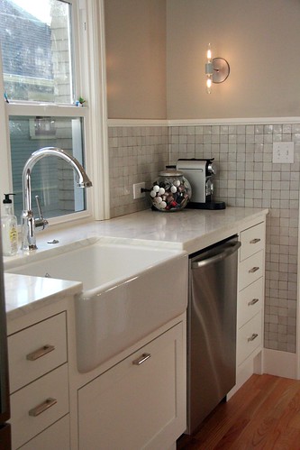
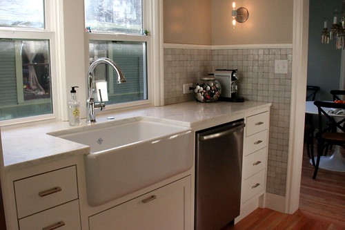 The sink and dishwasher opposite the stove. Fridge (not pictured) is to the left of the sink.
Looking at the pictures I see I forgot a few views. In addition I didn't think to take pictures of our sun room which is off the kitchen. The sun room got a make over too and now feels like part of the kitchen. Anyhoo, take a peek -
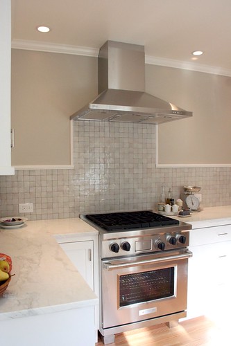 Opposite the windows and sink.
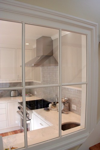 An interior window to the sun room adds light.
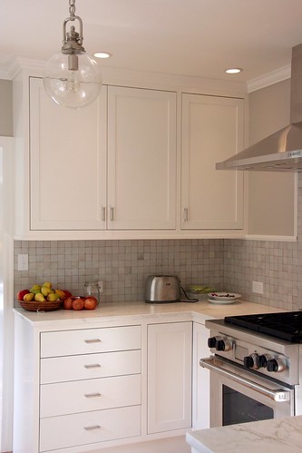 Door way to the dining room is to the left of the drawers.
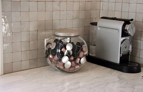
Tile and counter top close-up.
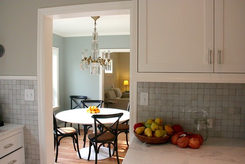
From the kitchen into the dining room:
Note to self - must take a picture of my "big huge American" fridge for my European friends.





7 comments:
Stunning!
Katy,
This is absolutely beautiful. I love your taste. I love the colors. I love the sink. I love the range. All of it.
I'm sure you are excited to prepare a Thanksgiving feast here!
D
Beautiful! I love it. We hope to do ours in a few years and this is definitely the look/feel I want. I like how simple it is but it is not cold/modern. Great job!
Katy, it is beautiful. Where do I order the clean counters? So happy for you.
Aunt Mary
Holy cow, Katy. I seriously wouldn't have recognized it. I think I need a house tour before we leave for QC retreat in March!!!
Your kitchen is gorgeous! Would you mind revealing what you used on your backsplash and counters? The materials look so fresh and organic and work beautifully together.
Hi Anonymous,
The counters are calcatta marble and the tile is Moroccan, purchased from Ann Sacks.
http://www.annsacks.com/home.jsp
Post a Comment