Showing posts with label house. Show all posts

Friday, April 13

Tilt your head

when you look at these photos.  Flickr has switched photo editing software and there is no longer a straightening tool!  Argh!!  The only time I haven't had to straighten my photos was at the leaning tower of Pisa.  With those photos I figured the tilt-ier the better.  Needless to say, that tool is essential to my photo editing process.  From what I've read a straightening tool is in the works.  Hope it is implemented soon.

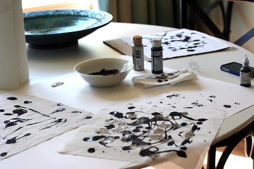
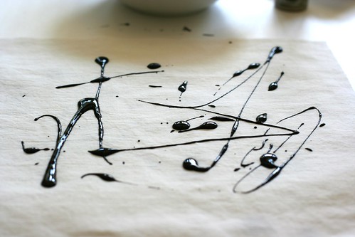
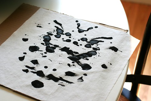
Anyhoo, the real topic of this post is not my cockeyed view of the world but my blank dining room wall.  I taped up some paper the same size as the IKEA frames I purchased and taped my inkblots onto them.  This was AFTER I panicked and decided the original ink blots were too small, faint and yellowed to work well in the dining room.  During the panic I quickly cut white squares of fabric and, with black watered down acrylic paint, attempted to make my own ink blots.  Then I compared my inkblots to the originals and hated them and realized I'd just wasted 1.5 hours of my time.  Typical Katy.  Must make things so much more complicated than they are.

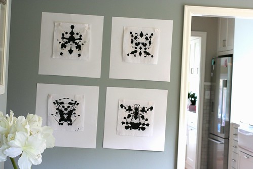
I taped up the originals (seen below) and decided they were great.  The antiquing worked really well with our creamy curtains and trim paint.  They were small and looked almost elegant.
Ink Blots
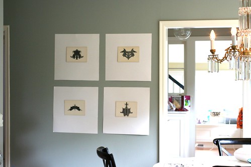
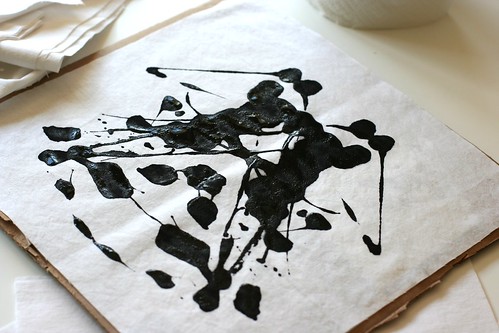
I also taped up some that I made - I actually liked 2 of my inkblots (the top 2.)  However, they looked too contrived. Too contrast-y and too obvious. I like some of them but not for the walls.  Pillows?  Who knows. 
Homemade Ink Blots

Making the inkblots was kinda fun.  I was guided by this tutorial. I threw in some metallic gold paint for fun.

 Homemade Inkblots Making and Inkblot Homemade Inkblot

Homemade Inkblot
I know it is hard to tell from the photos, but what set of inkblots do you like?  If you could see the curtains I know you'd like the originals. Well, maybe you would. Now to get mats cut. Think I'll go for a soft white to ease the contrast between the art and frame. I'll share the wall when it is finished.

Wednesday, April 11

Ink Blots


I've been drawn to ink blots for over a year now.  They appeal to the psychology major in me as well as to the abstract art enthusiast.  I bought a set of original Rorschach ink blots from 1948 off of ebay.  This was over a year ago.  I have yet to get them framed and up on the wall.  I thought, as well as looking great, they'd be a good conversation piece.

I'm going to frame 6 of them; the black and white cards and 2 of the colored ones.  Not sure about frame color - black or white.  White may be tricky as the cards have yellowed slightly due to age.  Sounds like a trip to IKEA is in my future.  I'll likely buy both black and white frames and return what I don't use.

I've been seeing ink blot inspired items here and there.  Here are a few I've pinned.
Source: flickr.com via Katy on Pinterest

Thursday, November 17

Ta Da!

kitchen
Here it is, our finished beautiful kitchen! Let me tell you, it is unrecognizable compared to the old one. Bryce and I couldn't be happier with the result. The kitchen is light filled and feels quite spacious. It is hard to believe it is the same space. Unfortunately I don't have before pictures. I'll see if our architect does. That'll put it in perspective for you. Our kitchen was sad, dank, and un-user friendly.
kitchen
The sink and dishwasher opposite the stove. Fridge (not pictured) is to the left of the sink.

Looking at the pictures I see I forgot a few views. In addition I didn't think to take pictures of our sun room which is off the kitchen. The sun room got a make over too and now feels like part of the kitchen. Anyhoo, take a peek -
Kitchen
Opposite the windows and sink.
Kitchen
An interior window to the sun room adds light.
Kitchen
Door way to the dining room is to the left of the drawers.
Kitchen
kitchen
Tile and counter top close-up.
From the kitchen into the dining room:
kitchen to livingroom
Note to self - must take a picture of my "big huge American" fridge for my European friends.

Tuesday, November 15

Voila!

Bedroom
As you can see we've decided on wallpaper #3 - Krysantemer in the gray colorway. Most of you liked #1 & #5 the best. I like these too and I think they are definitely bedroom-y. However, I went with #3 because I loved the color palette - purple, periwinkle/gray, black and gold. The others, while lovely, seemed to easy and I wanted to push myself a bit.
Bedroom
I'm just thrilled with the result. The colors are rich, complex and interesting and have a warmth to them that is not noticeable online. Now my head is buzzing with paint color choices. I tried Comet by Benjamin Moore which is the blue you can see on the walls in the pictures. I do like this but it is a bit too blue. A little more gray may be nice. Depending on my energy level I may try one more color or I may leave it with Comet. Comet seems to me to be the definition of a hyacinth blue - it is a rich periwinkle with some definite grape thrown in there.

Are you curious about the most expensive wallpaper? Most of you were right on! It was #2 - Rampura. Many of you noticed that it looked hand printed, which it was. Even the wood blocks used for the stamping were hand carved. When I went to order it I learned it was $250.00 a roll!! And I needed 2 rolls! CRAZY! Needless to say that was cost prohibitive.

Things do have a way of working out and I'm super satisfied with the one I chose. Thank you for your feedback on my post. It was a lot of fun to read your comments! I've updated my previous wallpaper post with the name and maker of each paper.

Thursday, November 10

Wallpaper pickle

Bedroom
In addition to our kitchen we are also redoing (or doing) our bedroom. Bryce and I are using this move back as an opportunity to fix up and change the decor in our house. It is pretty exciting (to me, anyway) to actually choose how I want the house to look instead of making do with hand-me-downs or cheap "it'll dos."

The architect, Amy, who designed our kitchen is also helping us with some interior design around the house. I tell ya, it is money very well spent. Bryce and I don't know what we're doing. We know what we like when we see it, but we don't know how to "get the look" ourselves. This is where Amy comes in. She provides ideas and acts as a sounding board as we search for paint, furniture, and other accouterments. It is really a collaborative process but Amy keeps us pointed in the right direction.

One of the rooms in need of help was our master bed room. Bryce and I had not done *anything* to it beside paint it. Seriously, nothing - no curtains, pictures on the wall, headboard, side tables - nothing. Our bedroom is part of an addition we added to the house while I was pregnant with Audrey. 2 years later we moved to Lux, the bedroom still untouched. Amy looked at the space and suggested hanging wallpaper on the area behind our bed. Fun, right?

As I've found, choosing wall paper is time consuming and surprisingly it can be VERY expensive.

Take a look at the contenders below. I want you to do 2 things -

1) Tell me which one you like the most.

2) Tell me what one is the most expensive.

Glow Duck Egg by Prestigious
Rampura by Schumacher
Krysantemer in Gray
Antoinette by Dulux
Asuka by Osborne & Little

I'll give you some time to respond (please do!) and then I'll provide the links and names of all the wallpapers - including the price of the most expensive one. Shock, horror!

Wednesday, October 8

Framing

Bryce and I have wanted a picture wall in our house for a long time. I've been overwhelmed with this project until just recently when I saw some examples that match my aesthetic and look doable. The task just seemed too daunting - matching frames? mats? black and white? color? what pictures? I did know that I wanted it to look pulled together without being too matchy matchy. Look at these two and see what you think -

I've already started collecting pictures for this one. I decided on color pictures and brown frames that don't all have to been exactly the same. I've gotten hung up on choosing the photos- candid or posed or both? And the sizes of each one. I'm drawn to this because of the use of color. I wanted to get this done before our move, but there is no chance of that happening. So, this may be on hold until we move back to the states. I saw this collection on Poppytalk.

I love the look of this one! I also like that it uses standard 4x6 inch pictures so there is no need to special order larger prints. The solid colors in a few of the frames give the eye a place to rest and throw in some color (the use of which is one of my decorating goals.) I like how they've mixed face shots with ones of nature. This seems more casual than the first look. It's made by duct taping inexpensive frames together. It would be cute in a kids bedroom too. I saw this on Domino.

Finally picked up a frame for my Keep Calm and Carry on print. Thinking I may need one of these for each room of our house. Can't tell myself this enough.

+++++++++++++++++++++++++++++++++++++++++++++++++++++++++
CHANGE
Let's have our Halloween Challenge Tin due on Monday, October 20th instead of the 13th. Hope that's okay with you all!
++++++++++++++++++++++++++++++++++++++++++++++++++++++++
Related Posts Plugin for WordPress, Blogger...